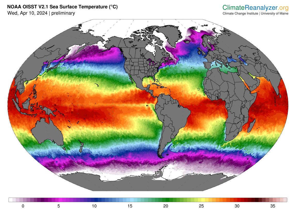
What a warm winter it’s been. That’s on top of a hot hot hot summer. It’s no coincidence that this chart from the University of Maine reflects rising sea surface temperatures.
What an eye opening post with data that should make everyone sit up and take notice. Check out the lead on this piece, The Climate Charts Are Not OK:
The chart looks wrong. It looks like a malign mistake, or like two separate charts have been combined in some nefarious way. Like an abomination made mundane through math…The charts are hilariously underpowered attempts to depict just how out-of-balance we have rendered the world.
Wow, that’s a shocker, right? “How out-of-balance” humans “have rendered the world.” What a slap in the face for humanity. Instead of making things better, we trashed the Earth, its oceans, like some crazy band trashing a hotel room.
The author of this piece, Dave Levitan, is doing his best to grab our attention. Why? This chart that shows something horrible.
It’s not just the oceans, of course. Last year was the warmest year in recorded history, and probably in at least 125,000 years. The U.S. saw more billion-dollar weather disasters in 2023 – 28 of them, from Hurricane Idalia in Florida to the Maui wildfires – than in any previous year. Antarctic sea ice cratered to unprecedented levels in 2023. The list of the ten warmest years on record includes each of the last ten years; ten years from now, it will presumably contain only those ten years, give or take an outlier from the current list.
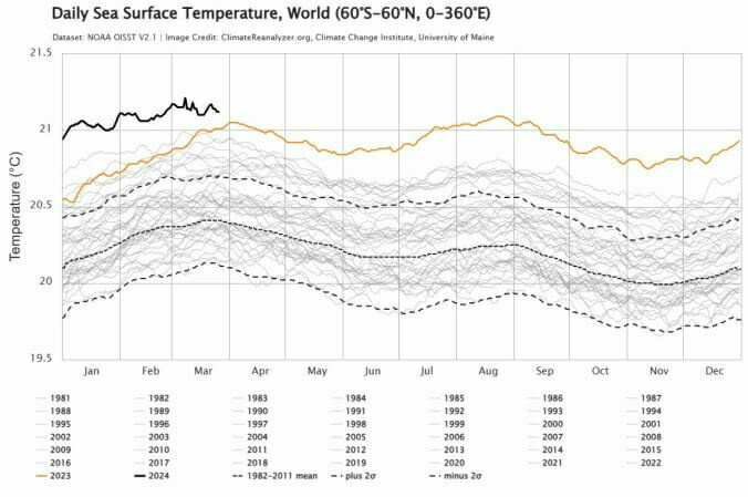
Chart Source: Climate ReAnalyzer via the University of Maine
When you see the chart, you realize, “Oh, heck. He’s right. We have goofed things up.” The only thing Dave Levitan fails to offer is hope for a better tomorrow. In fact, it’s not only going to get worse, our current efforts are insufficient to the task of making things better.